In Color Comparison Display
I thought I would share this fun display I have made for many years to compare our new In Colors to our existing colours.
This is really easy to make. Each of the white squares is cut at 2 1/2 X 2 1/2 inches and the coloured squares at 1 1/4. I have a punch for this size, but you could still do it with a trimmer.
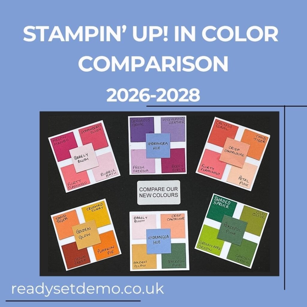
This year my comparisons are as follows:
For Barely Blush I showed Melon Mambo, Strawberry Slush, Bubble Bath and Flirty Flamingo.
For Hydrangea Hue I showed Gorgeous Grape, Highland Heather, Fresh Freesia and Berry Burst – although you could switch out the berry for Balmy Blue.
For Crisp Cantaloup I showed Calypso Coral, Timid Tiger, Flirty Flamingo and Petal Pink.
For Golden Glow I showed Timid Tiger, Crushed Curry, Cajun Craze and Pumpkin Pie
For Peaceful Pine I showed Shaded Spruce, Old Olive, Granny Apple Green and Garden Green.
If you haven’t already done so, make sure you check out my FREE In Color Bookmark printable for this year too.